
Beemac
Logistics
Redesigned the logistics website from user research to implementing a tailored UI, enhancing usability
Project Overview
I led a full UX/UI redesign for a logistics company after identifying a drop-off between high-performing campaigns and low site conversions. Through user interviews, navigation testing, and heuristic evaluation, I introduced a Track Your Load feature and improved site clarity, resulting in a 66% increase in traffic and a 50% lift in quote submissions.
Problem
Solution
Logistics customers, who need a 3PL partner, seek accessible technological features and company credibility for them to confidently manage and track their shipments.
A user-friendly and straightforward website design that builds credibility with our customers while providing access to advanced technological features to improve their shipment tracking.
User Research
Interviews revealed a major trust gap: users wanted visibility into their shipments, with 87% explicitly requesting a self-serve tracking feature. Within a week, I successfully recruited and interviewed several users, aged 25 to 70, who matched our customer profile, conducting the interviews via phone call.
User statistics:
-
100% of users rely on reviews / testimonials to boost trust of 3PL company
-
86% of users are tech savy depending on a user friendly website to quickly reach out to 3PL employees. the other 14% are ages 65+ that rely heavily on salesperson professionalism and transparent communication
-
57% of users (ages 25-30) mentioned a “user- friendly” website, keeping it simple to find important information
-
87% of users requested a tracking feature on logistics website

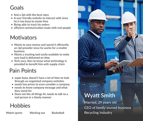
Defining the User
Following user research and pain point analysis, I crafted two distinct persona archetypes segmented by age demographics. This allowed me to map divergent user goals while uncovering shared friction points across the user journey
.png)


Problem Statement
Logistics customers in need of a 3PL partner seek accessible technology and company credibility to confidently manage and track their shipments.
Information Architecture
Once I finalized the core problem and identified key improvements, like adding a new feature, showcasing more testimonials, and streamlining the overall layout. Using a card sorting technique, I scrambled the previous navigation and observed how users naturally grouped pages. This helped me structure a more intuitive, user-centered navigation system.
.png)
Navigation Testing
In this phase, before adding any content to the pages, I focused on testing the navigation across our desktop, tablet, and iPhone low-fidelity versions to evaluate whether key tasks for users are quick and easy to complete. I recruited several users through LinkedIn and internal connections, using Microsoft Teams to observe how they interacted with the design.

UI Style Guide
.png)
Heuristic User Testing
Based on heuristic testing, I refined dropdown styling to better align with the brand tone, clarified service messaging to reduce confusion about what the company does, and updated imagery to better represent logistics services.
User's feedback:
-
Does that picture really represent “less-than-truckload” ?
-
I wish the drop downs matched the tone of the rest of design, they seem too harsh
-
I am not too sure what your company does
-
This design is neat and straight to the point, I like how it is easy to follow
-
I like how there are two ways to press “request a quote”
.png)
A Design That Delivers Results
After launching the redesigned website, the early results have already validated the strategy behind the overhaul. The site now scores 95 in Accessibility, 96 in Best Practices, and 92 in SEO, reflecting the impact of clearer user flows, intentional layout decisions, and accessibility-centered improvements. Within the first two months, overall traffic increased by 66%, and quote submissions rose by 50%, showing that users are finding what they need more easily and engaging more deeply with the site’s content.
This project is an ongoing process, and I’m continuing to track month-over-month new visitors, quote activity, and user behavior to understand long-term trends and how increased conversions translate into revenue. Seeing how quickly the design changes have made the experience more intuitive, faster, and more user-friendly has been incredibly rewarding, and I’m excited to keep refining and evolving the platform as the data continues to grow.